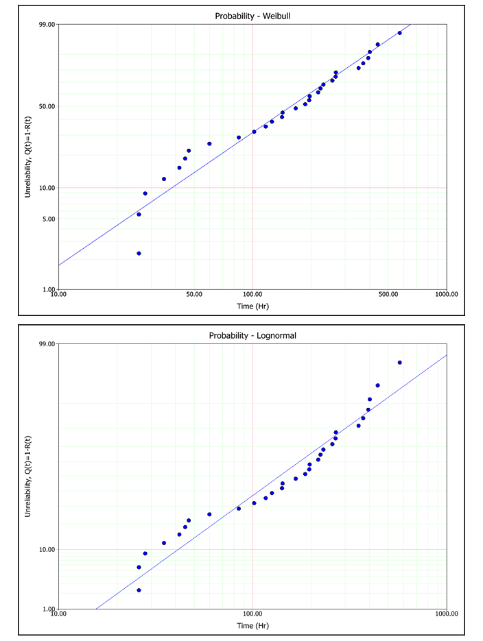
Template:Weibull probability plot
Probability
The Probability plot shows the trend in the probability of failure over time. The plotting positions of the data points are determined by the failure/suspension times in the data set (x-axis) and their corresponding unreliability estimates (y-axis).
When the parameters have been calculated using rank regression analysis, the regression line is fitted to the data points on the plot in order to obtain the distribution parameters. Therefore, the plot can also be used to compare how different distributions fit a particular data set. The closer the regression line tracks the points on the plots, the better the fit.
In contrast, the maximum likelihood estimation (MLE) method obtains the solution of the line from the likelihood function, not by the plotting positions of the data points. Therefore, the line is not expected to track the points on the plot, and the plot should not be used to evaluate the fit of a distribution when using MLE.
The next figures show the rank regression analysis of single data set using a Weibull distribution and a lognormal distribution. As you can see, the probability plot shows that the Weibull distribution presents the better fit to this particular data set
