Template:Using contour plots
Using Contour Plots
To determine whether two data sets are significantly different and at what confidence level, one can utilize the contour plots provided in Weibull++. By overlaying two contour plots from two different data sets (analyzed using the same distribution) at the same confidence level, one can visually assess whether the data sets are significantly different at that confidence level if there is no overlap on the contours. The disadvantage of this method is that the same distribution must be fitted to both data sets.
Example 1:
Using a Contour Plot to Compare Two Designs
The design of a product was modified to improve its reliability. The reliability engineers want to determine whether the improvements to the design have significantly improved the product's reliability. The following data sets represent the times-to-failure for the product. At what significance level can the engineers claim that the two designs are different?
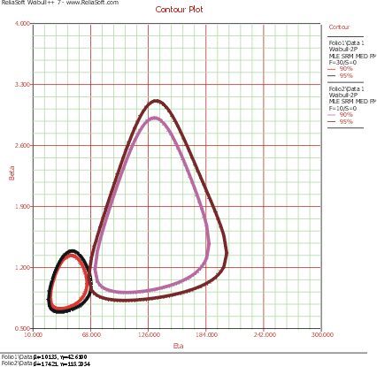
The data sets are entered into separate Weibull++ standard folio data sheets, and then analyzed with the two-parameter Weibull distribution and the maximum likelihood estimation (MLE) method. The following figure shows the contour plots of the data sets superimposed in an overlay plot. This plot is configured to show the contour lines that represent the 90% and 95% confidence levels.
As you can see, the contours overlap at the 95% confidence level (outer rings), but there is no overlap at the 90% confidence level (inner rings). We can then conclude that there is a statistically significant difference between the data sets at the 90% confidence level. If we wanted to know the exact confidence level (i.e., critical confidence level) at which the two contour plots meet, we would have to incrementally raise the confidence level from 90% until the two contour lines meet.
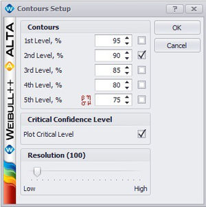
Weibull++ includes a utility for automatically obtaining the critical confidence level. For two contour plots that are superimposed in an overlay plot, the Plot Critical Level check box will be available in the Contours Setup window, as shown next.
The plot critical level is the confidence level at which the contour plots of the two data sets meet at a single point. This is the minimum confidence level at which the contour lines of the two different data sets overlap. At any confidence level below this minimum confidence level, the contour lines of the two data sets will not overlap and there will be a statistically significant difference between the two populations at that level. For the two data sets in this example, the critical confidence level 94.243%. This value will be displayed in the Legend area of the plot.
Note that due to the calculation resolution and plot precision, the contour lines at the calculated critical level may appear to overlap or have a gap.
Critical Confidence Level
The Critical Confidence Level utility is located as an option in the Overlay Contour Plot Setup window. To activate the utility, check the “Plot Critical Level” box as shown in the figure below.
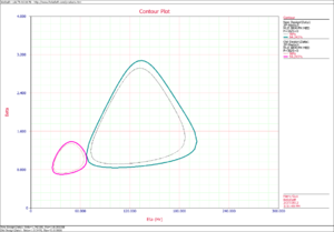
The critical confidence level utility determines the confidence level at which the contour plots of two data sets meet at a single point. This is the minimum confidence level at which the contour plots of the two different data sets overlap. At any confidence level below this minimum confidence level, the contour plots of the two data sets will not overlap and there will be a statistically significant difference between the two populations at that level. For the two data sets in the above Example 2, the critical confidence level 94.243%. This can be seen in the figure below.
The above plot shows the contour plot at confidence level of 90% and at the critical level of 94.243%. Please notice that due to the calculation resolution and plot precision, sometimes at the calculated critical level, the two curves may look still having a little bit of overlap or separation.


