Template:Using contour plots
Using Contour Plots
To determine whether two data sets are significantly different and at what confidence level, one can utilize the contour plots provided in Weibull++. By overlaying two contour plots from two different data sets (analyzed using the same distribution) at the same confidence level, one can visually assess whether the data sets are significantly different at that confidence level if there is no overlap on the contours. The disadvantage of this method is that the same distribution must be fitted to both data sets.
Example 15
The following data represent the times-to-failure for a product. Certain modifications were made to this product in order to improve its reliability. Reliability engineers are trying to determine whether the improvements were significant in improving the reliability.
At what significant level can the engineers claim that the two designs are different?
Solution to Example 15
For both data sets the two-parameter Weibull distribution best fits the data. The contour plots were generated and overlaid on a MultiPlot.
[math]\displaystyle{ }[/math]
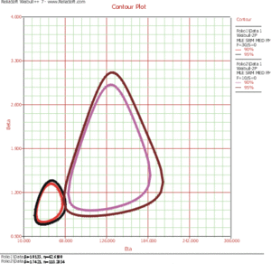
From this plot, it can be seen that there is an overlap at the 95% confidence level and that there is no overlap at the 90% confidence level. It can then be concluded that the new design is better at the 90% confidence level. If a analyst wanted to know at exactly what confidence the two contour plots meet, she would have to incrementally raise the confidence level from 90% until the two plots met. In fact, this search process has been automated by the Confidence Level Detector utility.
Critical Confidence Level Detector
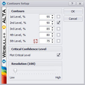
The Confidence Level Detector (CLD) utility is located as an option in the Contour Plot Setup window. To activate the utility, check the “Plot Critical Level” box as shown in the figure below.
The CLD utility determines the confidence level at which the contour plots of two data sets meet at a single point. This is the minimum confidence level at which the contour plots of the two different data sets overlap. At any confidence level below this minimum confidence level, the contour plots of the two data sets will not overlap and there will be a statistically significant difference between the two populations at that level.
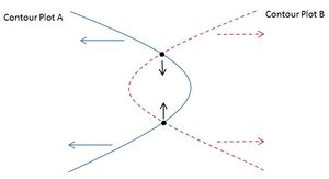
Let and be the 99% two-sided lower bounds on for populations 1 and 2, respectively, and let and be the 99% two-sided upper bounds on for populations 1 and 2, respectively. 99% is used as the starting confidence level to make sure that the contour plots are large enough to overlap. The confidence levels are decreased, which in turn decreases the size of the contour plots of the two populations, causing the intersection points of the two contour plots move towards each other, as illustrated in the figure below.
The confidence level is decreased until the contour plots meet at a single point.
It is often desirable to be able to compare two sets of reliability or life data in order to determine which of the data sets has a more favorable life distribution. The data sets could be from two alternate designs, manufacturers, lots, assembly lines, etc. Many methods are available in statistical literature for doing this when the units come from a complete sample (i.e., a sample with no censoring). This process becomes a little more difficult when dealing with data sets that have censoring, or when trying to compare two data sets that have different distributions. In general, the problem boils down to that of being able to determine any statistically significant difference between the two samples of potentially censored data from two possibly different populations. This section discusses some of the methods available in Weibull++ that are applicable to censored data.
Simple Plotting
One popular graphical method for making this determination involves plotting the data with confidence bounds and seeing whether the bounds overlap or separate at the point of interest. This can be easily done using the Overlay Plot feature in Weibull++. This approach can be effective for comparisons at a given point in time or a given reliability level, but it is difficult to assess the overall behavior of the two distributions because the confidence bounds may overlap at some points and be far apart at others.
Contour Plots
To determine whether two data sets are significantly different and at what confidence level, one can utilize the contour plots provided in Weibull++. By overlaying two contour plots from two different data sets at the same confidence level, one can visually assess whether the data sets are significantly different at that confidence level if there is no overlap on the contours. The disadvantage of this method is that the same distribution must be fitted to both data sets.
Example: Using a Contour Plot to Compare Two Designs
The design of a product was modified to improve its reliability. The reliability engineers want to determine whether the improvements to the design have significantly improved the product's reliability. The following data sets represent the times-to-failure for the product. At what significance level can the engineers claim that the two designs are different?
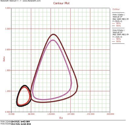
The data sets are entered into separate Weibull++ standard folio data sheets, and then analyzed with the two-parameter Weibull distribution and the maximum likelihood estimation (MLE) method. The following figure shows the contour plots of the data sets superimposed in an overlay plot. This plot is configured to show the contour lines that represent the 90% and 95% confidence levels.
As you can see, the contours overlap at the 95% confidence level (outer rings), but there is no overlap at the 90% confidence level (inner rings). We can then conclude that there is a statistically significant difference between the data sets at the 90% confidence level. If we wanted to know the exact confidence level (i.e., critical confidence level) at which the two contour plots meet, we would have to incrementally raise the confidence level from 90% until the two contour lines meet.
Weibull++ includes a utility for automatically obtaining the critical confidence level. For two contour plots that are superimposed in an overlay plot, the Plot Critical Level check box will be available in the Contours Setup window, as shown next.
The plot critical level is the confidence level at which the contour plots of the two data sets meet at a single point. This is the minimum confidence level at which the contour lines of the two different data sets overlap. At any confidence level below this minimum confidence level, the contour lines of the two data sets will not overlap and there will be a statistically significant difference between the two populations at that level. For the two data sets in this example, the critical confidence level 94.243%. This value will be displayed in the Legend area of the plot.
Note that due to the calculation resolution and plot precision, the contour lines at the calculated critical level may appear to overlap or have a gap.
Life Comparison Tool
Another methodology, suggested by Gerald G. Brown and Herbert C. Rutemiller, is to estimate the probability of whether the times-to-failure of one population are better or worse than the times-to-failure of the second. The equation used to estimate this probability is given by:
- [math]\displaystyle{ P\left[ {{t}_{2}}\ge {{t}_{1}} \right]=\int_{0}^{\infty }{{f}_{1}}(t)\cdot {{R}_{2}}(t)\cdot dt\,\! }[/math]
where [math]\displaystyle{ {{f}_{1}}(t)\,\! }[/math] is the pdf of the first distribution and [math]\displaystyle{ {{R}_{2}}(t)\,\! }[/math] is the reliability function of the second distribution. The evaluation of the superior data set is based on whether this probability is smaller or greater than 0.5. If the probability is equal to 0.5, then it is equivalent to saying that the two distributions are identical.
Sometimes we may need to compare the life when one of the distributions is truncated. For example, if the random variable from the first distribution is truncated with a range of [L, U}, then the comparison with the truncated distribution should be used. For details, please see Stress-Strength Analysis.
Consider two product designs where X and Y represent the life test data from two different populations. If we simply wanted to determine which component has a higher reliability, we would simply compare the reliability estimates of both components at a time [math]\displaystyle{ t\,\! }[/math]. But if we wanted to determine which product will have a longer life, we would want to calculate the probability that the distribution of one product is better than the other. Using the equation given above, the probability that X is greater than or equal to Y can be interpreted as follows:
- If [math]\displaystyle{ P=0.50\,\! }[/math], then lives of both X and Y are equal.
- If [math]\displaystyle{ P\lt 0.50\,\! }[/math] or, for example, [math]\displaystyle{ P=0.10\,\! }[/math], then [math]\displaystyle{ P=1-0.10=0.90\,\! }[/math], or Y is better than X with a 90% probability.
Example:
Using the Life Comparison Tool to Compare Two Designs
Using the same data set from the contour plot example, use Weibull++'s Life Comparison tool to estimate the probability that the units from the new design will outlast the units from the old design.
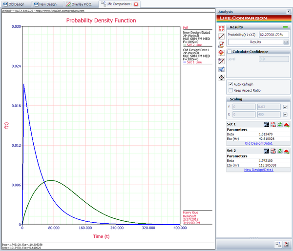
First, enter the data sets into two separate Weibull++ standard folios (or two separate data sheets within the same folio) and analyze the data sets using the two-parameter Weibull distribution and maximum likelihood estimation (MLE) method. Next, open the Life Comparison tool and select to compare the two data sets. The next figure shows the pdf curves and the result of the comparison.
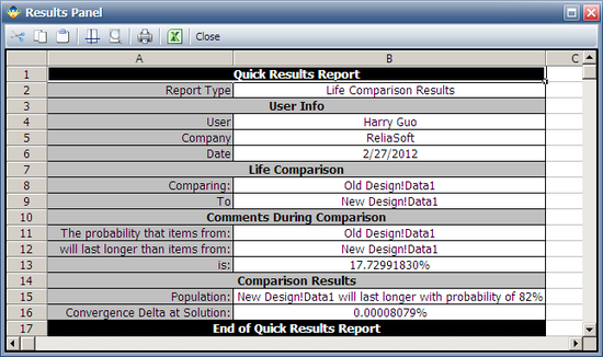
The comparison summary is given in the Results Panel window.
