Standard Folio Plots
 |
Weibull++ provides many useful plots. We will use this example to illustrate them. Assume we have the following failure data.
| Number in State | State F or S | State End Time |
| 2 | F | 20 |
| 3 | F | 45 |
| 4 | F | 89 |
| 2 | F | 100 |
| 5 | F | 123 |
| 15 | S | 150 |
| 20 | S | 200 |
Analyze the above data using MLE, 2P Weibull distribution, we have the following results.
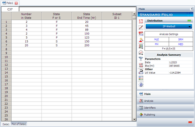
Click on the Plot button, Weibull++ automatically shows the first plot probability plot.
1. Probability Plot
You also can choose to display the confidence bounds on time, reliability, or both. Click on the Confidence Bounds… link.
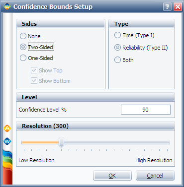
Then click on OK,
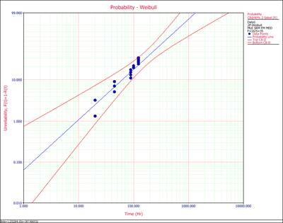
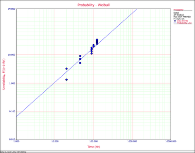
Probability plot shows the predicted (the line) and observed probability of failure (the dots, calculated from non-parametric LDA). If the straight line can fit the dots well, it means the distribution in use is suitable for this data set.
Click on the Plot Type drop down list to view all the available plots.
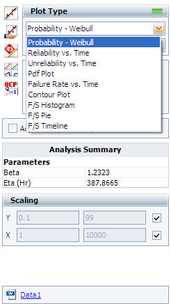
We will explain each plot type in below.
2. Reliability vs. Time Plot.
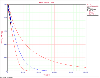
It shows how reliability changes with time. Similar to the probability plot, it has both the predicted and the observed reliability values on the plot.
3. Unreliability vs. Time Plot.
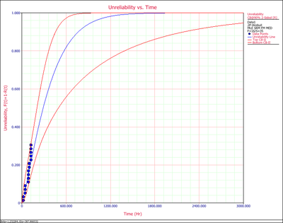
It shows how Unreliability (Probability of Failure) changes with time. Similar to the probability plot, it has both the predicted and the observed values on the plot.
4. pdf Plot
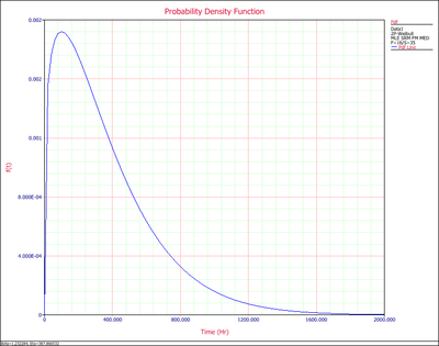
pdf (probability density function) plot shows how the failure data distributed at different time range, if the failure data indeed follows the distribution in use. The range around the peak of the pdf curve is where most of the failures occur.
5. Failure Rate vs. Time Plot
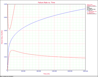
Failure rate plot shows how the failure rate (the frequency of having failures) changes with time. For this example, we can see it has an increasing failure rate.
6. Contour Plot
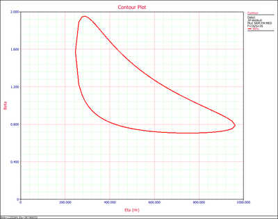
Contour plot shows the jointed range of the estimated distribution parameters. With higher confidence level, the range will be larger.
7. Histogram
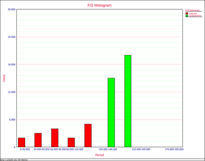
Histogram shows the number of failures/suspensions at a given time interval. Users can set the time interval at the control panel. The Y value is the number of observations; the X value is the time range of when the observations occurred.
8. F/S Pie Chart
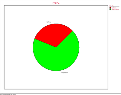
F/S Pie visually displays the percentage of failures and suspensions in the data set.
9. F/S Timeline
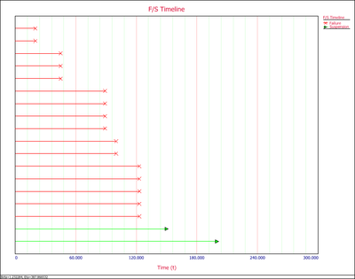
F/S Timeline plot graphically display the values for each failure and suspension. For example, from the above plot, you can see there are 6 failures between 60 and 120 hours.