Contour Plot Example: Difference between revisions
No edit summary |
Kate Racaza (talk | contribs) m (moved Template:Example: Life Comparison-Compare Two Designs Using Contour Plot to Contour Plot Example: incorrect namespace) |
(No difference)
| |
Revision as of 05:22, 15 August 2012
Life Comparison - Compare Two Designs Using Contour Plot
The following data sets represent the times-to-failure for a product. Certain modifications were made to this product in order to improve its reliability. Reliability engineers are trying to determine whether the improvements were significant in improving the reliability.
At what significance level can the engineers claim that the two designs are different?
Solution
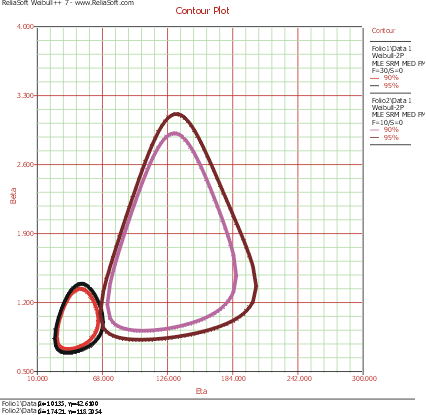
For both data sets, the two-parameter Weibull distribution best fits the data. The contour plots were generated and plotted together on an overlay plot in Weibull++.
[math]\displaystyle{ }[/math]
From this plot, it can be seen that there is an overlap at the 95% confidence level and that there is no overlap at the 90% confidence level. It can then be concluded that the new design is better at the 90% confidence level. If an analyst wanted to know at exactly what confidence the two contour plots meet, she would have to incrementally raise the confidence level from 90% until the two plots met. In fact, this search process has been automated by the Critical Confidence Level feature in Weibull++, as described next.
