Template:ALTA Standard Folio Plot Example: Difference between revisions
No edit summary |
No edit summary |
||
| Line 144: | Line 144: | ||
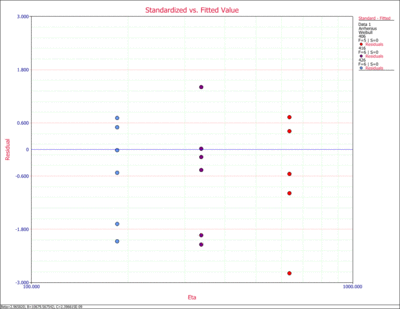
The Standard vs. Fitted Value plot is useful for detecting behavior not modeled in the underlying relationship. However, when heavy censoring is present, this plot becomes difficult to interpret. The plot displays the value of the scale parameter of the selcted life distribution on the x-axis and the value of the standardized residual on the y-axis. | The Standard vs. Fitted Value plot is useful for detecting behavior not modeled in the underlying relationship. However, when heavy censoring is present, this plot becomes difficult to interpret. The plot displays the value of the scale parameter of the selcted life distribution on the x-axis and the value of the standardized residual on the y-axis. | ||
[[image: Plots_Example_13.gif|thumb|center|400px]] | |||
Revision as of 22:26, 19 March 2012
ALTA Standard Folio Plot Type Example
This example illustrates the different plots that can be generated in ALTA. Consider to the following accelerated testing data.
| Time Failed (hr) | Temperature (K) |
| 248 | 406 |
| 456 | 406 |
| 528 | 406 |
| 731 | 406 |
| 813 | 406 |
| 164 | 416 |
| 176 | 416 |
| 289 | 416 |
| 319 | 416 |
| 340 | 416 |
| 543 | 416 |
| 92 | 426 |
| 105 | 426 |
| 155 | 426 |
| 184 | 426 |
| 219 | 426 |
| 235 | 426 |
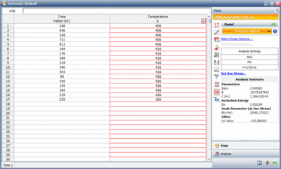
The data was analyzed using the Arrhenius relationship and the Weibull distribution. The next figure shows the ALTA folio with the results of the analysis.
Given this analysis the following plots can be generated in ALTA.
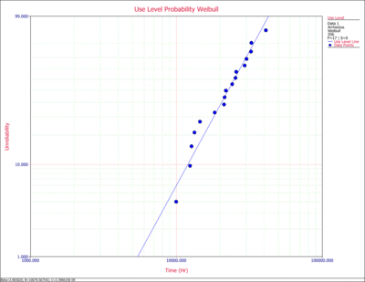
1. Use Level Probability Plot
The use level probability plot uses the selected model to extrapolate the times-to-failure at the observed (accelerated) stress level to the specified use stress level. In this example the use temperature was set at 356K. The data points are then reordered and plotted, along with the overall solution based on the Arrhenius-Weibull model at 356K.
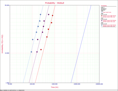
2. Probability Plot
The probability plot presents the data at the entered individual stress levels (406K, 416K and 426K). In addition, the use stress level line, based on the estimated parameters of the Arrhenius-Weibull model and the specified stress level of 356K, is plotted. The y-axis represents unreliability and the x-axis represents time.
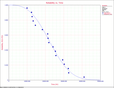
3. Reliability vs. Time Plot
The Reliability vs. Time plot shows how the reliability changes with time. The plotted points represent the transformed times-to-failure data based on the Arrhenius-Weibull model and the use temperature of 356K. The data points are then reordered and plotted, along with the overall solution based on the Arrhenius-Weibull model.
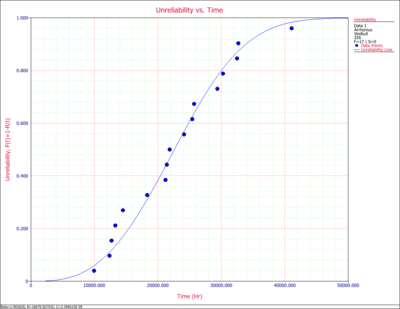
4. Unreliability vs. Time Plot
The Unreliability vs. Time plot show how the ureliability (probability of failure) changes with time. The plotted points represent the transformed times-to-failure data based on the Arrhenius-Weibull model and the use temperature of 356K. The data points are then reordered and plotted, along with the overall solution based on the Arrhenius-Weibull model.
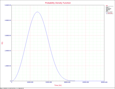
5. Pdf Plot
The pdf (probability density function) plot displays the relative frequency of failures as a function of time at the specified use stress level of 356K. Although the pdf plot is less important in most reliability applications than the other plots available in ALTA, it provides a good way of visualizing the distribution and its characteristics such as shape, skewnwss, mode, etc.
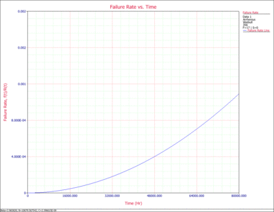
6. Failure Rate vs. Time Plot
The Failure Rate vs. Time plot displays how the failure rate (in failures per unit time) changes with time at the specified use stress level of 356K.
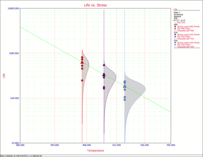
7. Life vs. Stress Plot
The Life vs. Stress plot displays the behavior of multiple metrics for the specified life distribution (in this case the eta parameter of the Weibull distribution) as a function of stress. The slope and the intercept are the parameters of the life-stress relationship (in the case of the Arrhenius relationship). The imposed pdfs represent the distribution of the data at each stress level.
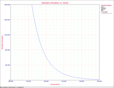
8. Std. vs. Stress Plot
The Standard Deviation vs. Stress Plot displays the standard deviation as a function of stress. It is a useful plot in accelerated testing analysis, as it probides information about the spread of the data at each stress level.
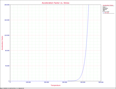
9. AF vs. Stress Plot
The Acceleration Factor vs. Stress plot displays the acceleration factor as a function of stress based on the specified use stress level of 356K. The acceleration factor is a ratio of the use stress level divided by the life at accelerated stress level.
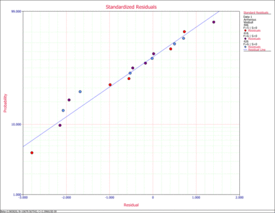
10. Standardized Residuals Plot
The standardized Residuals plot is useful for determining the adequacy of the selected life distribution. The plot line has a mean equal to zero and negative values are possible. The appropriate probability transformation is plotted on the y-axis and the value of the residual is plotted on the x-axis. If the model adequately fits the data then the points should track the plot line.
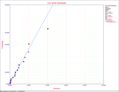
11. Cox-Snell Residuals Plot
The Cox-Snell Residuals plot is useful for determining the adequacy of the selected life distribution. The plot used an exponential probability plotting paper and is on the positive domain. If the model adequately fits the data then the points should track the plot line.
12. Standard vs. Fitted Value Plot
The Standard vs. Fitted Value plot is useful for detecting behavior not modeled in the underlying relationship. However, when heavy censoring is present, this plot becomes difficult to interpret. The plot displays the value of the scale parameter of the selcted life distribution on the x-axis and the value of the standardized residual on the y-axis.
