Weibull++ Warranty Folio Plot ptProbability: Difference between revisions
Jump to navigation
Jump to search
No edit summary |
No edit summary |
||
| Line 5: | Line 5: | ||
|} | |} | ||
{| class="FCK__ShowTableBorders" border="0" cellspacing="1" cellpadding="1" | {| class="FCK__ShowTableBorders" border="0" cellspacing="1" cellpadding="1" | ||
|- | |- | ||
| valign="middle" |{{Font|Warranty Folio Plot Probability - Weibull|11|tahoma|bold|gray}} | | valign="middle" |{{Font|Warranty Folio Plot Probability - Weibull|11|tahoma|bold|gray}} | ||
Revision as of 21:24, 9 February 2012
 |
| Warranty Folio Plot Probability - Weibull |
| Weibull++ |
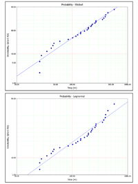
ProbabilityThe Probability plot shows the trend in the probability of failure over time. The plotting positions of the data points are determined by the failure/suspension times in the data set (x-axis) and their corresponding unreliability estimates (y-axis). The next figures show the rank regression analysis of single data set using a Weibull distribution and a lognormal distribution. As you can see, the probability plot shows that the Weibull distribution presents the better fit to this particular data set |
| Weibull++ Plots |

