Weibull++ Standard Folio Plot ptFSHistogram: Difference between revisions
No edit summary |
No edit summary |
||
| Line 8: | Line 8: | ||
|- | |- | ||
| valign="middle" |{{Font| Diagram Simulation Point Availability |11|tahoma|bold|gray}} | | valign="middle" |{{Font| Diagram Simulation Point Availability |11|tahoma|bold|gray}} | ||
|- | |- | ||
| valign="middle" | | | valign="middle" | | ||
| Line 25: | Line 23: | ||
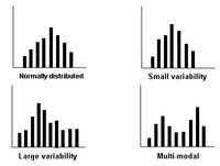
A small variability in the distribution suggests that most of the units are probably operating within the design limits, while a large variability suggests that the units may be operating outside of their design limits. A multi-modal (multiple peaks) distribution suggests that multiple failure modes or mixed subpopulations may exist in the data set | A small variability in the distribution suggests that most of the units are probably operating within the design limits, while a large variability suggests that the units may be operating outside of their design limits. A multi-modal (multiple peaks) distribution suggests that multiple failure modes or mixed subpopulations may exist in the data set | ||
|} | |||
{{Font|Learn more from...|11|tahoma|bold|gray}} | |||
{| border="0" align="left" cellpadding="0" cellspacing="3" | |||
|- | |||
| [[Image:Helpblue.png]] | |||
| [Link1 the help files...] | |||
|- | |||
| [[Image:Book blue.png]] | |||
| [http://www.reliawiki.com/index.php/Weibull%2B%2B_Plots the theory textbook...] | |||
|- | |||
| [[Image:Articleblue.png]] | |||
| [Link3 related article(s)...] | |||
|- | |- | ||
| | | [[Image:Bulbblue.png]] | ||
| [http://www.reliawiki.com/index.php/Temporary_needs_example_page use example(s)...] | |||
|} | |} | ||
Revision as of 17:04, 7 March 2012
 |
| Diagram Simulation Point Availability |
Failures/Suspensions HistogramThe Failures/Suspensions Histogram shows the frequency distribution of the failures and suspensions in the data set. The data set is separated into time intervals, and the number of failures/suspensions that fall into each time interval are plotted in a bar chart. This chart has two display options:
You have the option to adjust the time intervals to get a good indication of how the data points are distributed. Note that if the histogram has intervals that are, in theory, infinitesimally small, the chart will result in a plot of the probability density function (pdf). The following charts show some examples of the different frequency distributions that may appear in a histogram. A small variability in the distribution suggests that most of the units are probably operating within the design limits, while a large variability suggests that the units may be operating outside of their design limits. A multi-modal (multiple peaks) distribution suggests that multiple failure modes or mixed subpopulations may exist in the data set |
Learn more from...
| [Link1 the help files...] | |
| the theory textbook... | |
| [Link3 related article(s)...] | |
| use example(s)... |

