1P Exponential Example: Difference between revisions
Lisa Hacker (talk | contribs) No edit summary |
Lisa Hacker (talk | contribs) No edit summary |
||
| (5 intermediate revisions by 2 users not shown) | |||
| Line 1: | Line 1: | ||
<noinclude>{{Banner Weibull Examples}}</noinclude> | <noinclude>{{Banner Weibull Examples}} | ||
''This example appears in the [https://help.reliasoft.com/reference/life_data_analysis Life data analysis reference]''. | |||
</noinclude> | |||
'''1-Parameter Exponential Probability Plot Example''' | '''1-Parameter Exponential Probability Plot Example''' | ||
6 units are put on a life test and tested to failure. The failure times are 7, 12, 19, 29, 41, and 67 hours. Estimate the failure rate for a 1-parameter exponential distribution using the probability plotting method. | |||
In order to plot the points for the probability plot, the appropriate reliability estimate values must be obtained. These will be equivalent to <math>100%-MR\,\!</math> since the y-axis represents the reliability and the <math>MR\,\!</math> values represent unreliability estimates. | |||
<center><math>\begin{matrix} | <center><math>\begin{matrix} | ||
| Line 18: | Line 16: | ||
41 & 100-73.56=26.44% \\ | 41 & 100-73.56=26.44% \\ | ||
67 & 100-89.09=10.91% \\ | 67 & 100-89.09=10.91% \\ | ||
\end{matrix}</math></center> | \end{matrix}\,\!</math></center> | ||
Next, these points are plotted on an exponential probability plotting paper. A sample of this type of plotting paper is shown next, with the sample points in place. Notice how these points describe a line with a negative slope. | Next, these points are plotted on an exponential probability plotting paper. A sample of this type of plotting paper is shown next, with the sample points in place. Notice how these points describe a line with a negative slope. | ||
| Line 25: | Line 22: | ||
[[Image:weibull EPP.png|center|400px|]] | [[Image:weibull EPP.png|center|400px|]] | ||
Once the points are plotted, draw the best possible straight line through these points. The time value at which this line intersects with a horizontal line drawn at the 36.8% reliability mark is the mean life, and the reciprocal of this is the failure rate <math>\lambda </math>. | Once the points are plotted, draw the best possible straight line through these points. The time value at which this line intersects with a horizontal line drawn at the 36.8% reliability mark is the mean life, and the reciprocal of this is the failure rate <math>\lambda\,\!</math>. | ||
This is because at <math>t=m=\tfrac{1}{\lambda }</math>: | This is because at <math>t=m=\tfrac{1}{\lambda }\,\!</math>: | ||
::<math>\begin{align} | ::<math>\begin{align} | ||
| Line 32: | Line 29: | ||
R(t)= & {{e}^{-\lambda \cdot \tfrac{1}{\lambda }}} \\ | R(t)= & {{e}^{-\lambda \cdot \tfrac{1}{\lambda }}} \\ | ||
R(t)= & {{e}^{-1}}=0.368=36.8%. | R(t)= & {{e}^{-1}}=0.368=36.8%. | ||
\end{align} | \end{align}\,\!</math> | ||
The following plot shows that the best-fit line through the data points crosses the <math>R=36.8%\,\!</math> line at <math>t=33\,\!</math> hours. And because <math>\tfrac{1}{\lambda }=33\,\!</math> hours, <math>\lambda =0.0303\,\!</math> failures/hour. | |||
[[Image:weibull EPP2.png|center|400px|]] | [[Image:weibull EPP2.png|center|400px|]] | ||
Latest revision as of 21:44, 18 September 2023
New format available! This reference is now available in a new format that offers faster page load, improved display for calculations and images and more targeted search.
As of January 2024, this Reliawiki page will not continue to be updated. Please update all links and bookmarks to the latest references at Weibull examples and Weibull reference examples.
This example appears in the Life data analysis reference.
1-Parameter Exponential Probability Plot Example
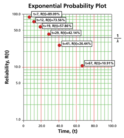
6 units are put on a life test and tested to failure. The failure times are 7, 12, 19, 29, 41, and 67 hours. Estimate the failure rate for a 1-parameter exponential distribution using the probability plotting method.
In order to plot the points for the probability plot, the appropriate reliability estimate values must be obtained. These will be equivalent to [math]\displaystyle{ 100%-MR\,\! }[/math] since the y-axis represents the reliability and the [math]\displaystyle{ MR\,\! }[/math] values represent unreliability estimates.
Next, these points are plotted on an exponential probability plotting paper. A sample of this type of plotting paper is shown next, with the sample points in place. Notice how these points describe a line with a negative slope.
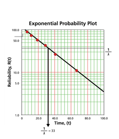
Once the points are plotted, draw the best possible straight line through these points. The time value at which this line intersects with a horizontal line drawn at the 36.8% reliability mark is the mean life, and the reciprocal of this is the failure rate [math]\displaystyle{ \lambda\,\! }[/math]. This is because at [math]\displaystyle{ t=m=\tfrac{1}{\lambda }\,\! }[/math]:
- [math]\displaystyle{ \begin{align} R(t)= & {{e}^{-\lambda \cdot t}} \\ R(t)= & {{e}^{-\lambda \cdot \tfrac{1}{\lambda }}} \\ R(t)= & {{e}^{-1}}=0.368=36.8%. \end{align}\,\! }[/math]
The following plot shows that the best-fit line through the data points crosses the [math]\displaystyle{ R=36.8%\,\! }[/math] line at [math]\displaystyle{ t=33\,\! }[/math] hours. And because [math]\displaystyle{ \tfrac{1}{\lambda }=33\,\! }[/math] hours, [math]\displaystyle{ \lambda =0.0303\,\! }[/math] failures/hour.


