Standard Folio Plots: Difference between revisions
Kate Racaza (talk | contribs) (proofread) |
Kate Racaza (talk | contribs) m (moved Example: Standard Folio Plot Type to Standard Folio Plots: incorrect title) |
(No difference)
| |
Revision as of 03:52, 23 July 2012
New format available! This reference is now available in a new format that offers faster page load, improved display for calculations and images and more targeted search.
As of January 2024, this Reliawiki page will not continue to be updated. Please update all links and bookmarks to the latest references at Weibull examples and Weibull reference examples.
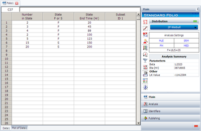
Weibull++ provides many useful plots. We will use this example to illustrate them. Assume we have the following failure data.
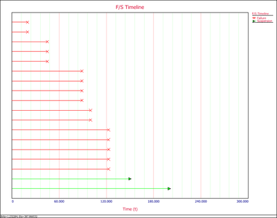
| Number in State | State F or S | State End Time |
| 2 | F | 20 |
| 3 | F | 45 |
| 4 | F | 89 |
| 2 | F | 100 |
| 5 | F | 123 |
| 15 | S | 150 |
| 20 | S | 200 |
Analyze the data using the 2P-Weibull distribution and the MLE analysis method. The results are shown next.
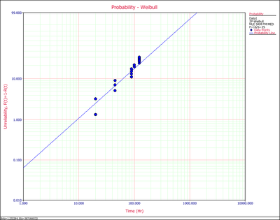
Click the Plot icon on the control panel. This displays the first plot probability plot.
1. Probability Plot
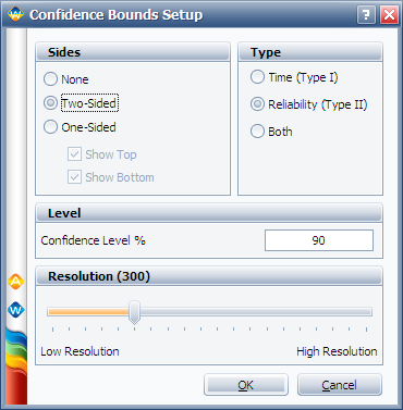
You can choose to display the confidence bounds on time, reliability, or both. To do this, click the Confidence Bounds… link on the control panel. The following picture shows the Confidence Bounds Setup window.
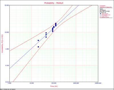
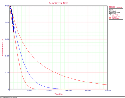
The following example shows the two-sided confidence bounds on the reliability.
The points on the probability plot represent the observed probability of failure, while the straight line represents the predicted probability of failure. If the line fits the points well, it indicates that the distribution in use is suitable for the data set.
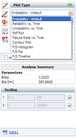
To view all the available plots for the Weibull++ standard folio, click the Plot Type drop down list on the control panel, as shown next.
All the available plot types are explained next.
2. Reliability vs. Time Plot shows how reliability changes with time. Similar to the probability plot, it has both the predicted and the observed reliability values on the plot.
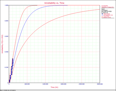
3. Unreliability vs. Time Plot shows how unreliability (probability of failure) changes with time. Similar to the probability plot, it has both the predicted and the observed values on the plot.
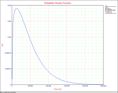
4. PDF Plot (probability density function plot) shows how the failure data are distributed at different time ranges, if the failure data indeed follows the distribution in use. The range around the peak of the pdf curve is where most of the failures occur.
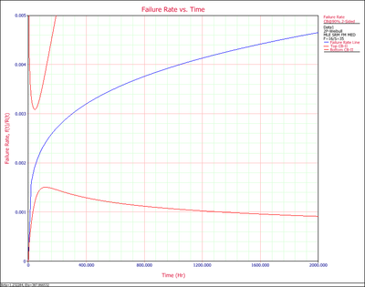
5. Failure Rate vs. Time Plot shows how the failure rate (the frequency of having failures) changes with time. For this example, we can see it has an increasing failure rate.
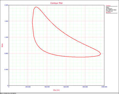
6. Contour Plot shows the jointed range of the estimated distribution parameters. With higher confidence level, the range will be larger.
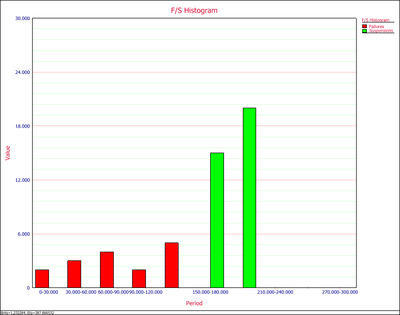
7. Histogram shows the number of failures/suspensions at a given time interval. Users can set the time interval at the control panel. The Y value is the number of observations, while the X value is the time range of when the observations occurred.
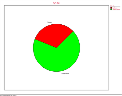
8. F/S Pie Chart visually displays the percentage of failures and suspensions in the data set.
9. F/S Timeline graphically displays the values for each failure and suspension. In the following example, there are 6 failures between 60 and 120 hours.

