Template:ALTA Standard Folio Plot Example: Difference between revisions
(Created page with ''''ALTA Standard Folio Plot Type Example''' This example illustrates the different plots that can be generated in ALTA. Consider to the following accelerated testing data. {| |…') |
No edit summary |
||
| Line 47: | Line 47: | ||
[[image: Plots_Example_1.gif|thumb|center|400px]] | [[image: Plots_Example_1.gif|thumb|center|400px]] | ||
Given this analysis the following plots can be generated in ALTA. | |||
'''1. Use Level Probability Plot''' | |||
The use level probability plot uses the selected model to extrapolate the times-to-failure at the observed (accelerated) stress level to the specified use stress level. In this example the use temperature was set at 356K. The data points are then reordered and plotted, along with the overall solution based on the Arrhenius-Weibull model at 356K. | |||
[[image: Plots_Example_2.gif|thumb|center|400px]] | |||
'''2. Probability Plot''' | |||
The probability plot presents the data at the entered individual stress levels (406K, 416K and 426K). In addition, the use stress level line, based on the estimated parameters of the Arrhenius-Weibull model and the specified stress level of 356K, is plotted. The y-axis represents unreliability and the x-axis represents time. | |||
[[image: Plots_Example_3.gif|thumb|center|400px]] | |||
Revision as of 21:27, 19 March 2012
ALTA Standard Folio Plot Type Example
This example illustrates the different plots that can be generated in ALTA. Consider to the following accelerated testing data.
| Time Failed (hr) | Temperature (K) |
| 248 | 406 |
| 456 | 406 |
| 528 | 406 |
| 731 | 406 |
| 813 | 406 |
| 164 | 416 |
| 176 | 416 |
| 289 | 416 |
| 319 | 416 |
| 340 | 416 |
| 543 | 416 |
| 92 | 426 |
| 105 | 426 |
| 155 | 426 |
| 184 | 426 |
| 219 | 426 |
| 235 | 426 |
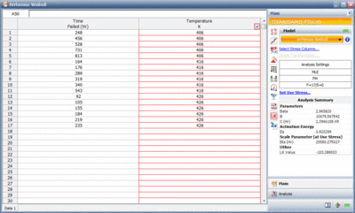
The data was analyzed using the Arrhenius relationship and the Weibull distribution. The next figure shows the ALTA folio with the results of the analysis.
Given this analysis the following plots can be generated in ALTA.
1. Use Level Probability Plot
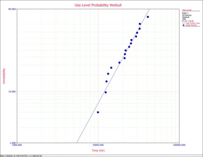
The use level probability plot uses the selected model to extrapolate the times-to-failure at the observed (accelerated) stress level to the specified use stress level. In this example the use temperature was set at 356K. The data points are then reordered and plotted, along with the overall solution based on the Arrhenius-Weibull model at 356K.
2. Probability Plot
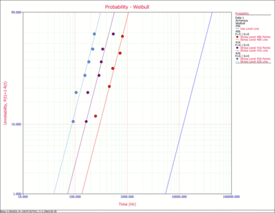
The probability plot presents the data at the entered individual stress levels (406K, 416K and 426K). In addition, the use stress level line, based on the estimated parameters of the Arrhenius-Weibull model and the specified stress level of 356K, is plotted. The y-axis represents unreliability and the x-axis represents time.


