Template:Weibull failure suspensions histogram: Difference between revisions
Created page with '===Failures/Suspensions Histogram=== The Failures/Suspensions Histogram shows the frequency distribution of the failures and suspensions in the data set. The data set is separate…' |
No edit summary |
||
| (3 intermediate revisions by the same user not shown) | |||
| Line 7: | Line 7: | ||
You have the option to adjust the time intervals to get a good indication of how the data points are distributed. Note that if the histogram has intervals that are, in theory, infinitesimally small, the chart will result in a plot of the probability density function (pdf). The following charts show some examples of the different frequency distributions that may appear in a histogram. | You have the option to adjust the time intervals to get a good indication of how the data points are distributed. Note that if the histogram has intervals that are, in theory, infinitesimally small, the chart will result in a plot of the probability density function (pdf). The following charts show some examples of the different frequency distributions that may appear in a histogram. | ||
<br/> | |||
[[Image:failureshistogram.png|center]] | [[Image:failureshistogram.png|center]] | ||
<br/> | |||
A small variability in the distribution suggests that most of the units are probably operating within the design limits, while a large variability suggests that the units may be operating outside of their design limits. A multi-modal (multiple peaks) distribution suggests that multiple failure modes or mixed subpopulations may exist in the data set | A small variability in the distribution suggests that most of the units are probably operating within the design limits, while a large variability suggests that the units may be operating outside of their design limits. A multi-modal (multiple peaks) distribution suggests that multiple failure modes or mixed subpopulations may exist in the data set | ||
Latest revision as of 17:50, 9 February 2012
Failures/Suspensions Histogram
The Failures/Suspensions Histogram shows the frequency distribution of the failures and suspensions in the data set. The data set is separated into time intervals, and the number of failures/suspensions that fall into each time interval are plotted in a bar chart. This chart has two display options:
- Display the probability density values, with or without the superimposed pdf. In this case, the height of each bar is proportional to the frequency of occurrence of the failures in each bin.
- Display the number of failures with or without the suspensions. In this case, the height of each bar is the number of failures (and suspensions, if the option is selected) in each bin.
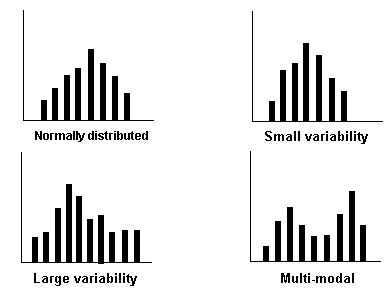
You have the option to adjust the time intervals to get a good indication of how the data points are distributed. Note that if the histogram has intervals that are, in theory, infinitesimally small, the chart will result in a plot of the probability density function (pdf). The following charts show some examples of the different frequency distributions that may appear in a histogram.

A small variability in the distribution suggests that most of the units are probably operating within the design limits, while a large variability suggests that the units may be operating outside of their design limits. A multi-modal (multiple peaks) distribution suggests that multiple failure modes or mixed subpopulations may exist in the data set