Weibull++ Standard Folio Plot ptFSHistogram: Difference between revisions
(Created page with '{{Template:NoSkin}} {| align="center" class="FCK__ShowTableBorders" border="0" cellspacing="1" cellpadding="1" |- ! scope="col" | {{Font|Reliability Web Notes|12|tahoma|bold|Blu…') |
No edit summary |
||
| Line 1: | Line 1: | ||
{{Template:NoSkin}} | {{Template:NoSkin}} | ||
{| align="center" class="FCK__ShowTableBorders" border="0" cellspacing="1" cellpadding="1" | {| align="center" class="FCK__ShowTableBorders" border="0" cellspacing="1" cellpadding="1" | ||
|- | |||
| align="center" valign="middle" | [[Image:weibullworld.gif|center]] | |||
|- | |- | ||
! scope="col" | | ! scope="col" | | ||
| Line 14: | Line 16: | ||
| align="center" valign="middle" |[http://www.reliawiki.com/index.php/Weibull%2B%2B_Plots Weibull++ Plots] | | align="center" valign="middle" |[http://www.reliawiki.com/index.php/Weibull%2B%2B_Plots Weibull++ Plots] | ||
|} | |} | ||
Revision as of 16:01, 27 January 2012
|
Reliability Web Notes |
|---|
| Diagram Simulation Point Availability |
| BlockSim |
Failures/Suspensions HistogramThe Failures/Suspensions Histogram shows the frequency distribution of the failures and suspensions in the data set. The data set is separated into time intervals, and the number of failures/suspensions that fall into each time interval are plotted in a bar chart. This chart has two display options:
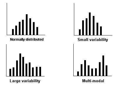
You have the option to adjust the time intervals to get a good indication of how the data points are distributed. Note that if the histogram has intervals that are, in theory, infinitesimally small, the chart will result in a plot of the probability density function (pdf). The following charts show some examples of the different frequency distributions that may appear in a histogram.
|
| Weibull++ Plots |

